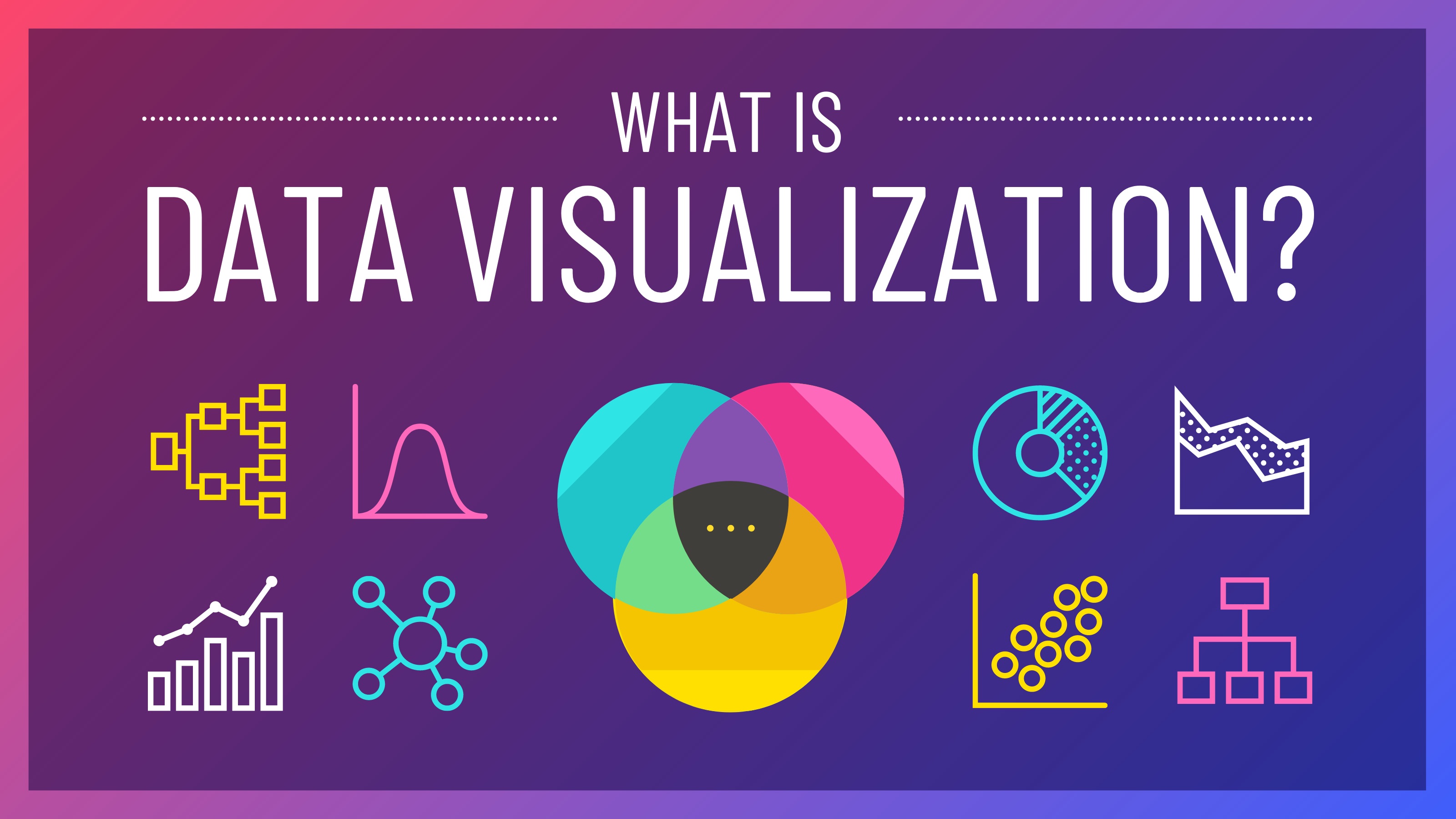
Basically, We aren’t naturally good at storytelling with data. Data visualization helps us shorten our time to understand and explain the insights contained in our data. So what exactly is meant by data visualization? Data visualization is depicting data in visual form (such as graphs, charts, infographics, animations, or maps) to make it easier to understand. The main uses for data visualization are to explore data and to communicate data. So, what’s the big deal with data visualization? Data visualization is critical because it assists us in reducing the time it takes to understand data and makes it easier for us to storytelling with data.
There are several Python libraries that can help us to create data visualizations. In this article, I’ll go through several python libraries that can be used for data visualization (static and interactive visualization). So let’s get started!
1. Matplotlib
In the first position, I will place Matplotlib as the most widely used Python library for data visualization. Matplotlib is a library used for classic data visualization. Everyone who starts learning data visualization in python must have used Matplotlib. The types of data visualization in Matplotlib include basic plots, plots of arrays, statistics plots, and plots for unstructured coordinates. There are many third-party packages built on top of and extending Matplotlib, such as Seaborn, Cartopy, DNA Features Viewer, Plotnine, WCS Axes, and more. Until now, Matplotlib version 3.5.2 has been released.
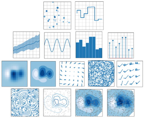
Several types of data visualization can be created using Matplotlib (Image compiled by the author).
Before using Matplotlib, you need to install it first.
# Install using pip:
pip install matplotlib
# Install using conda:
conda install matplotlib
You can read more about Matplotlib here.
2. Seaborn
Next, I will put Seaborn in second place after Matplotlib. Seaborn is a python library built on top of Matplotlib for data visualization. It provides a high-level interface for drawing attractive and informative statistical graphics. In addition, seaborn is also integrated with the pandas data structure. Seaborn is designed to be effective throughout a research project’s lifecycle. Seaborn supports rapid prototyping and exploratory data analysis by providing entire images from a single function call with minimum input. It can also be used to create polished, publication-quality figures because it provides many customization possibilities as well as exposes the underlying Matplotlib objects (Waskom, 2021). Until now, Seaborn version 0.11.2 has been released.

Several types of statistical data visualization can be created using seaborn (Image from Seaborn).
Before using Seaborn you need to install it first. Keep in mind, that when you install Seaborn then several other libraries such as NumPy, SciPy, pandas, and Matplotlib will also be installed.
# Install using pip:
pip install seaborn
# Install using conda:
conda install seaborn
You can read more about Seaborn here.
3. Plotly
After Seaborn, I will put Plotly as a python library for interactive data visualization. Plotly is an interactive visualization library that’s used for visualizing data in Jupyter, in the browser locally, or even hosting these graphs to be viewed on a platform for visualizations and dashboards created by the Plotly team called Dash. Plotly has over 40 chart types to choose from, covering a wide range of statistical, financial, geographic, scientific, and 3-dimensional applications. Plotly Python is built on the JavaScript library Plotly (plotly.js). Until now, Plotly for python version 5.8.0 has been released.
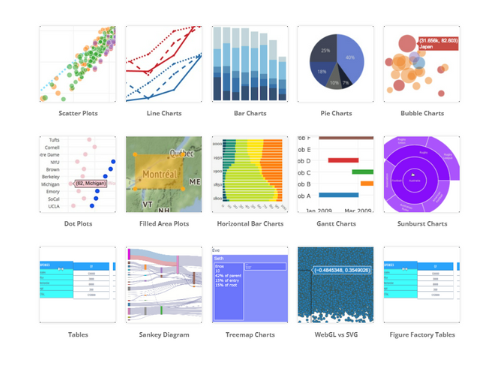
Several basic graphics on Plotly (Image from Plotly).
Before using Plotly you need to install it first.
Install using pip:
pip install plotly
#Install using conda:
conda install -c plotly plotly
You can read more about Plotly here.
4. Bokeh
In fourth place, there is Bokeh. Just like Plotly, Bokeh is a python library used for interactive data visualization. Bokeh focuses on the Python ecosystem, while Plotly builds on top plotly.js. Plots, dashboards, and apps that are created using Bokeh can be published in web pages or Jupyter notebooks. In addition, one of the advantages of Bokeh is that you can create JavaScript-powered visualizations without writing any JavaScript yourself. Until now, Bokeh version 2.4.3 has been released.
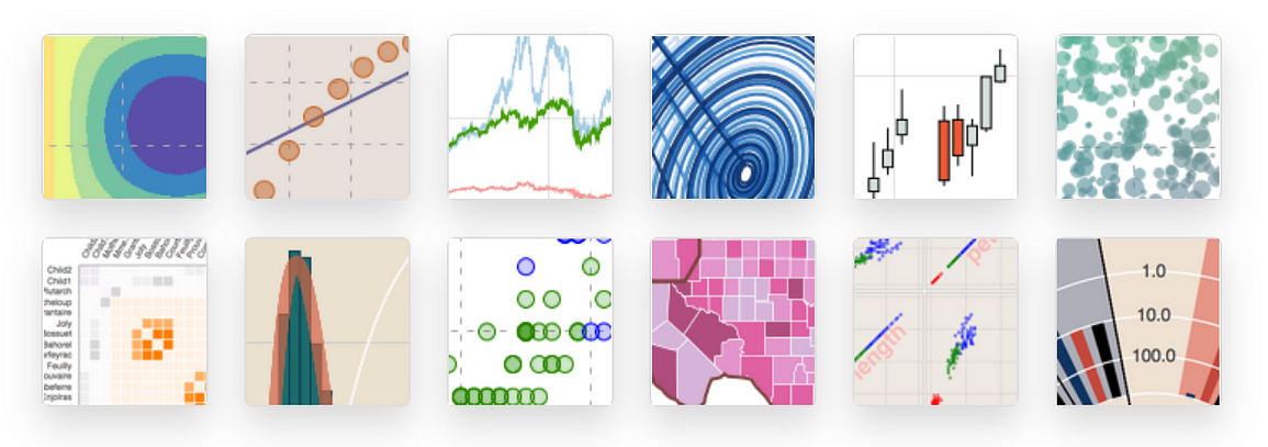
Several types of data visualization can be created using Bokeh (Image from Bokeh).
Before using Bokeh you need to install it first.
# Install using pip:
pip install bokeh
# Install using conda:
conda install bokeh
You can read more about Bokeh here.
5. Altair
In the fifth position, there is an Altair. Altair is a python library for declarative data visualization based on Vega and Vega-lite. The main concept of this library is that we don’t need to explicitly write every feature in the graph (such as the x-axis, y-axis, color, etc.). These details will be handled automatically by Altair. By using Altair, we can design data visualizations ranging from simple to complex using only relatively concise grammar. Until now, Altair version 4.2.0 has been released.
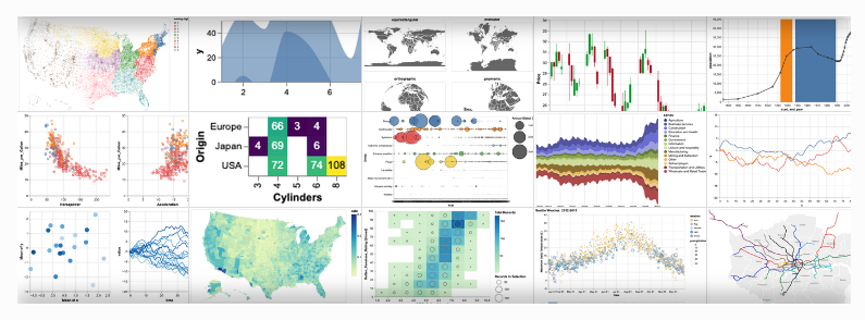
Several types of data visualization can be created using Altair (Image from Altair).
Before using Altair you need to install it first. Almost like Seaborn, when you install Altair, the following modules will also be installed as entrypoints, jsonschema, NumPy, Pandas, and Toolz.
# Install using pip:
pip install altair
# Install using conda:
conda install -c conda-forge altair
You can read more about Altair here.
6. Pydeck
in the last position, there is Pydeck as a popular python library for data visualization. Pydeck is a python library for high-scale spatial rendering and plots visualizations as layers on top of Mapbox. To use Pydeck you need internet access, if there is no internet access then the visualization will not render. With Pydeck we can enable or disable map controls and also modify the kind of map projection, like plotting in flat plane instead of plotting on a Mercator projection. Until now, Pydeck version 0.7.1 has been released.
Before using Pydeck you need to install it first.
# Install using pip:
pip install pydeck
# Install using conda:
conda install -c conda-forge pydeck
You can read more about Pydeck here.
References:
[2] Knaflic, C. (2015). Storytelling with Data: A Data Visualization Guide for Business Professionals. Wiley.
[3] Waskom, M. L., (2021). seaborn: statistical data visualization. Journal of Open Source Software, 6(60), 3021, https://doi.org/10.21105/joss.03021
[4] https://plotly.com/python/
[5] https://docs.bokeh.org/en/latest/index.html
[6] https://altair-viz.github.io/index.html
[7] https://deckgl.readthedocs.io/en/latest/
Original article:
https://medium.com/mlearning-ai/top-python-libraries-for-data-visualization-static-and-interactive-visualization-e5f1bc72de41
 Data Science Learning Resources